I recently spoke with Linda Mann about how she became a painter, the nature of still lifes, and how she makes pumpkins so intriguing. This interview includes images of several of her paintings. Her full portfolio, including details of the paintings found herein, can be seen at her website, www.lindamann.com, or by appointment. —Craig Biddle
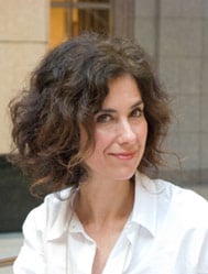 Craig Biddle: Linda, thank you for taking time away from the canvas to chat with me about your work.
Linda Mann: It’s my pleasure.
CB: Having tried my hand at painting, I’ve concluded that great painters fall into the same category as great pianists. They’re superhuman.
LM: [Laughing]
CB: Seriously, though, creating beautiful, engaging, fascinating works on canvas is an extremely difficult process, and I have several questions about it in relation to your work. But let me begin with a few preliminaries. How and when did you become an artist?
LM: In some ways, I’ve always been an artist. Ever since I can remember, I’ve been drawing and painting—before I even really knew what being an artist meant. I took great pleasure in drawing everything around me—there were never enough paper and pencils for me! In school, I took all the art classes I could and thought I would pursue a career as an artist.
But in high school I became discouraged, because what was being taught was largely modern or abstract art. I didn’t understand the point of it and began to think that if that was art, that wasn’t what I had in mind.
When it came time for me to decide what to study in college, after much debating, I chose industrial design instead of art. It seemed to combine aesthetics and the rationality that I found utterly lacking in modern art. Soon after I got my degree, however, I discovered that I actually wasn’t that good at it because my heart wasn’t really in it.
Over the years, I went from one design field to another—from industrial design to interior design to graphic design. I was always dissatisfied. Finally, I ended up in fashion design. While I was sketching costumes at a museum exhibit one afternoon, it struck me how much I’d always loved to draw. That was where my heart was. At that moment I decided to pursue fine arts again. I thought I could figure out a way to avoid the modern art that so discouraged me.
I took some classes at the San Francisco Academy of Art and then, after I moved to Seattle, at The Academy of Realist Art. I studied off and on there, taking classes in traditional drawing and painting techniques, anatomy, and portraiture. Most of my learning was actually done studying old art technique books from the turn of the last century. I found that the majority of recent art textbooks were emphasizing modern art and not the classical methods that I wanted to learn.
CB: So before you turned back to fine art, you designed fashion? Did you create any designs that went to market?
LM: No, I didn’t get that far. I was studying pattern-making, draping, sewing, and illustration. I had not gotten so far as to actually produce anything.
CB: So that was school only, not a career spell.
LM: Exactly.
CB: Given the various kinds of paintings that an artist might choose to create—portraits, figures, landscapes, seascapes, cityscapes, and so on—why have you chosen to focus on still lifes? What’s so great about still lifes, as it were?
LM: Something about still lifes is very intimate. Everybody is familiar with a tabletop with things on it—it’s right in front of you.
Landscapes are the world at large, out there; a portrait is involved with a person’s character, and complex issues of psychology, which aren’t what I’m mostly interested in. In a still life, the focus is on light and how we see. In this way, still-life painting seems to be more about epistemology than any other kind of painting. It says, “The world exists and I can know it.”
A still life is like a little world more than any other kind of painting. It suits me to be able to contemplate this piece of my world in front of me—and it’s available for study because it’s up close and personal.
Another thing I enjoy about still life is that I see the objects as actors on a stage. I’m the director. I tell them where to stand, I spotlight them, and they interact with each other according to their natures.
CB: I love the idea of the objects being actors on a stage in their own little world. Though I hadn’t thought of it in those terms, that’s exactly the way I see them when I look at your works. That’s what they are.
LM: Yes, I think about that quite consciously. It makes it fun for me, and it adds a kind of human element, even though it’s not a portrait.
CB: Have you done other kinds of painting or, more broadly, other forms of fine art?
LM: When I started studying I did portraiture, mostly in charcoal. I then started to paint portraits, but I found that I didn’t quite know what I wanted to do with them. I didn’t know how to make a portrait into a finished work of art that would be satisfying to me.
As for the other arts, I’ve been studying classical piano since I was a child, and I still play every day and take lessons. In the last year, I’ve also begun to study voice. I’m enjoying it quite a bit!
CB: So you’re double superhuman.
LM: [Laughter]
CB: Who are some of your favorite painters and paintings, and why?
LM: Oh, let’s see, I have a lot of favorite painters. I love Velasquez’s portraits, particularly Las Meninas, which is a portrait of the Spanish royal family. I love these because of the dramatic compositions in light and the dark and the skill shown in the bravura brushstrokes.
I love Vermeer, particularly Girl Holding a Balance. I also like The Milkmaid because of the glowing light and beautiful textures. The Vermeers seem largely to be about the way light flows in a setting, and I find that very compelling.
Holbein is a favorite, particularly his portrait of Sir Thomas Moore, at the Frick. I love his depiction of the character of the man, the composition, the color, and the sharp focus.
I’ll also add Van Dyck’s portraits. In these I love the drama, the character of his subjects, and his painterly style. Tiepolo I like for his vibrant, lush color and his mastery of drawing the human form with paint.
Lastly, I’ll mention one painter who likely no one’s ever heard of: Juan Sanchez Cotan, who was a Spanish still-life painter from the early 1600s. He did a still life called Quince, Cabbage, Melon and Cucumber (fig. 1), which is very dramatic and modern looking. That painting is actually what attracted me to still life. It’ll probably remind you of some of my paintings, as I was very much inspired by it!
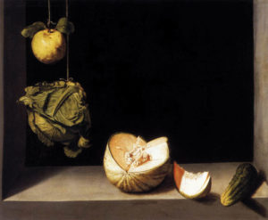
Juan Sanchez Cotan, Quince, Cabbage, Melon and Cucumber, 1602, Wikimedia Commons
CB: I’d never heard of Cotan, but it doesn’t surprise me that Vermeer is in the lineup, given your obvious fascination with light, about which I’ll have some questions later.
What are the essential elements of a still life?
LM: Well, I would say “things on a table”—which sounds kind of trivial, but that’s what it is. It’s things on a table with a backdrop and a light source. The important thing is that the subjects have to be up close. They can’t be far away. The composition has to be personal, like it’s right in front of you.
I always try to paint life size. Every “thing” you see in my paintings is usually the size that it actually is, which helps convey the illusion that you’re right there with the object.
Another essential of the still life is that the objects have to be arranged deliberately. It’s not just a hodgepodge. The objects have to be related to each other in some way, by shape, color, or position. So it’s not just a bunch of stuff—it’s ordered stuff.
CB: That harkens back to your earlier point about your works being little worlds in themselves, with the objects as characters interrelating. If you’re too far away or if the objects are not arranged in a way that creates relationships among them, then you don’t have that little world—you just have things.
LM: Exactly.
CB: So how do you go about choosing the objects and organizing a composition for a painting? And do you even call it a composition when you’re talking about the organization of the physical objects, or does that concept refer only to their organization on the canvas?
LM: I call the organization of the objects on the tabletop a composition. Most paintings begin with a particular thing that I want to paint. I have a collection of reproduction Greek vases, for example, and I might see one and think I really want to paint that.
So sometimes it’s just finding a beautiful object. I’ll take that object, set it on a table, shine a light on it, and I look. I think: What does it need? What other things would complement it? And then I begin to choose other things in relation to that main object, which usually becomes the focal point of the painting.
Occasionally I’ll have an idea for a painting that results from something I’ve seen. For example, I might go to an opera where the stage settings are lush, warm, and rich. If that image stays in my mind, I might decide I’d like to create that feeling in a painting. I’d look for objects around my house and studio that have that same feeling and color scheme.
It’s important when picking out objects for a still life that there’s some relationship between them. For instance, if I have an onion, I might use a shallot, too, because a shallot is similar to an onion in that it’s in the same vegetable family. That creates a feeling of unity. However, it’s also important that the shallot is a little bit different from the onion—it’s smaller, and the shape is more elongated. This gives the composition some variety and interest. So you have unity and variety, two important elements in any composition.
At this point in my career, I make a lot of these decisions subconsciously. Instead of thinking of the rules of composition, I’ll think, “These things look good together.” This isn’t arbitrary; it’s just that I’ve integrated and internalized the rules. I also don’t like to paint objects that are easily datable. I wouldn’t pick my cell phone, for example. I try to pick objects that are not so much tied to a particular time. Otherwise, the viewer would be taken out of the visual experience of my paintings and be tempted to read in a symbolic meaning in the object. So you’ll see in my paintings vases, bowls, bricks, and fabric; these are things you could have found at any time.
Organizing the composition itself is probably the most difficult part for me, more so than the actual act of painting. As I mentioned, there are rules of composition that have been developed and used by artists for centuries. There are different systems for dividing up the rectangle of the canvas in a pleasing way and using the lines as guides in the composition. The intersection of these lines can show you an effective place to position your focal point, for example. The most famous of these rules is the golden rectangle, which you’ve probably heard of. There are rules about balancing objects in a painting, for instance, balancing a large, heavy object on one side of the canvas with several lighter ones on the other. There are many rules about how to guide the viewer’s eye through a painting using line, value contrasts (light and dark), and color. It’s a complex subject that requires a lot of study.
When I began painting, I would try to apply some of those rules very consciously. I would think, okay, I’m going to divide up my painting into thirds and I’ll put my focal point where the thirds intersect—because that’s the rule.
Now, I find that after all of these years of composing paintings, I can make decisions pretty quickly, without a lot of conscious thought. Something either will look right or it won’t.
So, I’ll move things around and stand back and look at my setup through my viewfinder, which is a piece of cardboard with a cutout in the shape of the final canvas. That frames the image for me. I’ll close one eye, which flattens out the image a bit, making 3-D look more like 2-D, and ask myself how it looks. I might think, for instance, that it doesn’t look balanced, so I’d then ask myself what I could change to balance it.
There’s a constant battle between what looks right and what doesn’t look right, and it’s not always a clear-cut process. I might decide something looks wrong, but I can’t figure out why. Then, I might consult the rules.
After I’ve come up with a setup that I like, I photograph it. I’ll then print out my favorites. I’ll carry those photos around with me for days, studying them, deciding which ones I like, and why. I look for problems, and decide how to fix them. After I decide on my favorite, I’ll go back to the set-up and make adjustments. I’ll then do a full-size, detailed drawing. Using that as a guide, I’ll paint a quick, full-size oil study in black, grey, and white oil paint. It’s easier for me to judge a composition when it’s in black-and-white, without the distraction of color. Sometimes color is important in a composition, but if a composition doesn’t look good in black-and-white, I’ve found that it’s not going to look good in color. I’ll bring that study in the house, put it against the wall, and study it over the next few days.
So I’ll judge my compositions, not from standing in front of my three-dimensional setup, but from looking at the photos and the studies. The eye, you know, is a funny thing. If you’re looking at something in three dimensions, it sees it in a different way than if it were a painting. When you’re looking at it as a two-dimensional image, suddenly lines and shapes and the design they make become more important. When looking at a setup, your mind can trick you into thinking that something isn’t a shape, it’s a thing, as in real life. But if you’re looking at a study of it, it’s definitely a 2-D shape. It looks stylized, more like the finished work.
CB: How do you manipulate the light as you’re arranging a composition? And do you use natural light or man-made light?
LM: If it’s summer, I might take advantage of natural light and use the north light coming in my studio window, but usually I’ll set up a spotlight. I have a place I typically like to put the light. After all these years, I’ve found a spot that works for me. There are certain places you can light something that will help communicate the form of the objects, and other places where it might be confusing or cast odd shadows.
Often, I like to have an incandescent light for the major light source, and natural light, coming from the opposite side, for a secondary source. An example of this is Necklace and Greek Urn (fig. 2), which has incandescent light coming from the right and natural daylight coming from the left.
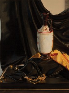
Mann, Necklace and Greek Urn, 2010
I have to manipulate the light to make sure the shadows work with the composition and aren’t distracting. Shadows, after all, are part of the composition—everything you see is a part of the composition.
I tend to like dramatic compositions with strong darks and lights. This is best achieved with an artificial light source. Indirect, natural light casts much more diffuse shadows, and my paintings that are lit that way have a quieter, subtler feel.
CB: Does your intended focal point ever change as you work? For instance, do you ever start out thinking that a particular object is going to be it and then later see that some other object has taken prominence?
LM: That does happen. Sometimes I’ll look at my photo or study and notice that something seems wrong: my focal point doesn’t seem to be drawing my attention. I think, “But this is the focal point,” and the painting says, “No, no, this is where the eye is going.” At that point, I’ll need to make a decision.
I may need to emphasize what I want the focal point to be. The eye, for example, is drawn to contrasts of light and dark—so where those meet, the eye wants to go. So I might increase the value contrast in the place that I want to be the focal point. The eye also likes detail and color, so I might add more detail and color to that area.
If I want to deemphasize the part of the painting that the eye was going to, and that I don’t want it to, I might mute contrast, details, and color. I might put a dark glaze of paint over it to make it look more grayed out, and then the eye will no longer go there.
So there are ways to manipulate the image. But sometimes I might realize that the new focal point is actually a better one! In that case, I’d try to mute the attention going to my original focal point.
Sometimes, in making these changes, I end up departing from reality. I might add a shadow where there is none, or paint something bright, whereas in reality, it is dull. I find that as long as I make these changes look plausible, and they further the cause of my composition, they work. If I alter too much, or do it in an unconvincing way, I can destroy the illusion of reality that is so crucial.
CB: The objects in your works, although painted, are richer, more sumptuous—in a sense, more real looking—than the objects in a photograph. For instance, in Squashes & Alliums in Paint Box (fig. 3), the fruits and onions are so substantial and three-dimensional looking that it seems as though I could reach over, pick one up, and feel its texture and weight. Why is this?
LM: That’s a very important question. Actually in The Romantic Manifesto, in the chapter on cognition, Ayn Rand talks about this issue, and I’d highly recommend for anyone interested in the subject to read that.
Let’s say we’re talking about a pumpkin. Most people have a very generalized view in their mind of what a pumpkin is. They haven’t really studied them. They might know that it’s orange and smooth and has ridges on it and a stem. But they don’t think about it too much.
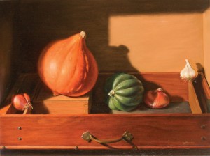
Mann, Squashes & Alliums in Paint Box, 2010
What the artist does, and what I try to do, is to really study the pumpkin, then leave out the unimportant parts and emphasize the important ones. My pumpkin has been essentialized and stylized—it’s been conceptualized. I think that’s why you get the feeling that it’s important and significant. The image is not just sense data. One of the values of such a painting is that the viewer gets the experience and pleasure of thinking conceptually.
CB: So that’s why the pumpkin conveys such significance. Tell me about how you make it so. What do you do technically to stylize the pumpkin? How do you make it so visually rich and intriguing?
LM: This is probably one of the most important points about my work. In my work, I try to convey how vision works and how light works with vision.
Vision is active. Your eye is constantly moving, so you can only focus on one tiny thing at a time. And light is always bouncing around. These are two very important things to keep in mind when you’re trying to paint something.
If a person’s eye can only focus on one thing at a time, it means that everything around that is out of focus. You don’t really experience that in everyday life because your eye is moving so fast, but in a painting I try to make the focal point more sharply in focus than peripheral areas. I can only do that so much; I can’t make something completely fuzzy. That wouldn’t look real to you.
Light is constantly bouncing around. The more I look at a still-life setup, the more it seems like the light’s vibrating. Light radiates out from the lit object.
Look at the white vase in Necklace and Greek Urn. The right side of the vase is brightly lit where the light is hitting it. In the setup, I could see a halo of light radiating out from the vase. When I painted it, I didn’t put a sharp, hard edge on that right side; I made the light flood out into the darkness. The light obscures the edge and overflows its boundaries. When painted that way, the viewer gets a strong impression of glowing light.
Another example is if you had a black piece of paper with a half-inch diameter hole cut out, and there was a bright light source behind, you wouldn’t actually see a sharp-edged white dot in the middle of a black plane. The light would seem to radiate out from the hole. So to paint it, I would paint a very fuzzy, soft-edged white dot, which shows the light actually pouring out from that hole.
Similarly, if you had a tiny black stone on a white cloth, you wouldn’t see a sharp edge around that black stone because all the light bouncing off of the cloth would almost engulf the stone. The stone would look more of a muted, almost yellowish color. I try to reproduce those effects.
Another example is in Gold Goblet, Vase & Pumice (fig. 4). If you look at the gold goblet in that painting, you’ll see that where the light hits it, I’ve spread the light out and into the surrounding areas. There is a halo of gold paint radiating out from the lit area, so as to make it seem like light really is hitting it and bouncing off.
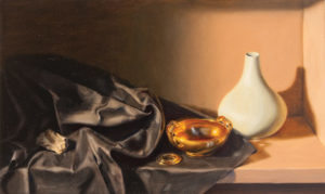
Mann, Gold Goblet, Vase & Pumice, 2009
CB: That’s fascinating. Now that I know what to look for, I can see this technique in Necklace and Greek Urn in the negative space of the handle. There’s a blur coming off the edge—
LM: Exactly; that’s a good way to put it. There’s part of the brain that says, “No, I know that has a hard edge to it and I have to paint the edge of the vase where I know the edge of the vase is.” That’s true. That is where the edge of the vase is, but what I’m trying to paint is light and its effects, which is tricky.
Another fact about light is that pigments will never be as light or as bright as actual light. White paint is just white paint, not light. So there are tricks you have to use to make the light in a painting really seem like it’s glowing.
In Greek Vase and Onions (fig. 5), the white onion looks very bright. This is because I surrounded it with darkness. The onion is the lightest thing in the painting. If there were many light areas in the painting, the onion wouldn’t appear so brilliant. I often have to darken the whole tone of a painting to make the lights appear brighter by contrast.
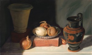
Mann, Greek Vase and Onions, 2002
CB: Are there any tricks involved in painting the shadows?
LM: Yes, definitely. A shadow isn’t just dark paint added to whatever color the shadow is cast on. If you did that, you’d end up with a very odd color. Shadows actually have quite a bit of color, which is hard to notice unless you study them.
Let’s say the light coming into your setup is from an incandescent bulb. The light from that bulb is a very warm, yellowish color. Shadows cast by that bulb are going to appear bluish. Conversely, shadows cast in a natural setting will appear warmish brown (daylight is cool, or bluish). In Glass Globe & Driftwood (fig. 6), for example, you can see that it’s lit by a warm incandescent bulb because the shadows are quite blue, as compared to Vase, Cloth, and Glass Bowl (fig. 7), which is lit by natural light, resulting in warm and yellowish shadows.
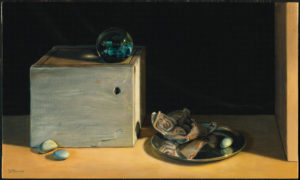
Mann, Glass Globe & Driftwood, 2006
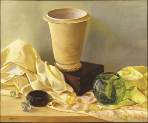
Mann, Vase, Cloth, and Glass Bowl, 2008
Things that are in shadows also appear to have less detail than things that are in the light. So you have to mute or eliminate details and take out intense colors. You also have to paint shadows very thinly, without a lot of built-up paint, to convey the absence of light. Areas of thick impasto, or built-up areas, look more like light because they have a dimension to them. Doing all these things will make the shadow look real.
Shadows also appear to have soft edges, in varying degrees of softness. A cast shadow will usually have a harder edge, and a form shadow (which is the shaded area of an object, not the shadow it casts onto another object) will have a very soft edge. In Squashes & Alliums in Paint Box, notice that the form shadow of the acorn squash has a very soft, gradual edge, but the shadow cast onto the squash from the left has a much sharper edge. These different edges both help to convey form and explain what’s happening in a painting.
CB: How do you think about depicting color?
LM: The color of an object will appear differently depending on how it’s lit and what it’s near. In Squashes & Alliums in Paint Box, you’ll notice where the orange squash is lit the strongest (where the highlight is), the color is much more muted. Light tends to blast away color. You don’t see color in a highlight, and you often don’t see color in a shadow. You actually see the most color in a form where a highlighted area meets a shadow. So the most intense orange on the squash is where the form shadow transitions into the light.
An object reflects the colors of the objects it is near. In Pumpkin and Squash (fig. 8), you can see the orange of the pumpkin reflected onto the green acorn squash where they almost touch.
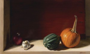
Mann, Pumpkin and Squash, 2005
Because light is active, there are some effects of color that aren’t always easy to see. I’ll often find that if I’m looking right at an object, and then look away for a moment, so I see it only out of the corner of my eye, I’ll have an impression of color that wasn’t there before. For example, when painting Pumpkin and Squash, when I looked at where the pumpkin met the tabletop, and then glanced slightly away, I sensed a very intense warm reddish color at the edge. When I looked back again, the color seemed to disappear. All I saw was an orange pumpkin and a tan table. I try to honor these fleeting effects in my paintings. I actually painted a bright red edge along the bottom of the pumpkin. I never saw this color when looking directly at the setup, but it looks just right in the painting. Without the red, the painting wouldn’t convey the sense of warmth and reality that it does.
CB: Aside from light and color, what are the other important issues you think about when painting?
LM: The way edges are treated very much affects the sense of reality you can achieve in a painting. One way you can tell a beginning painter is that all the edges in his paintings look very sharp and hard, because he thinks, “Things have edges, and I’m going to paint them carefully.” But an artist always has to think about how something actually looks, not how he thinks it should look.
Looking at the squash in Squashes & Alliums in Paint Box again, you’ll see that at the far right side of the squash, the part that’s in the shadows has a very fuzzy, blurry edge. That ends up conveying two things. It conveys that it’s in a shadow, where you can’t see edges as clearly; it also conveys that it’s a rounded form. Objects that are round actually have no edge, the form is constantly tapering back, and by painting a softer edge there, you help the eye to realize that the form is actually round. Angular forms, such as the box that the squash is sitting on, will have a sharper edge, and I paint it that way. So depending on how you treat an edge, you can convey a sense of reality.
CB: From what you’ve said so far, it seems to me that drawing must be very important in your work.
LM: Yes, your drawing has to be correct, or the painting will never look right. You have to really know how to draw, and you have to know perspective. If not, the sense of reality will be destroyed; the painting will be a failure, no matter how well executed.
If your ellipse at the top of a vase, for example, is not absolutely correct, it’s going to throw the whole painting off. I actually spend a lot of time constructing my ellipses so that they’re perfect. I measure the angle from my eye to the object, so that I can get the angle of the ellipse correct. This way, the ellipses will actually change their angle as they go from the bottom of the painting to the top. If you don’t get all of that right, it just ruins the illusion. I also mark my vanishing point (usually above my canvas on my easel) and make sure that all parallel lines converge to it.
CB: Once you have the drawing right, how do you proceed? What’s involved in the process of applying the paint?
LM: First, I transfer the drawing to my canvas. I rub on the back with a pencil, to make a carbon paper, place it on the canvas, and trace over the lines. I usually have to correct the drawing again on the canvas, as every step you go through you tend to lose a little precision in your drawing.
Then, the painting starts. I do an underpainting first, meaning a monotone version of the painting. It is very undetailed and simple. It’s similar to the black-and-white study in looks, but I’ll usually do mine in burnt sienna (a brick color) mixed with white. It ends up looking like a very washed-out, orange and white version of the painting. It provides me a base to paint on.
This accomplishes a couple things. First, it unifies the canvas. If there’s one color underneath the whole painting it gives the illusion that the whole painting is awash in the same light. If you have a painting where some things look more orange or blue overall, you don’t get the feeling that there’s a consistent light source and that it could exist in the world.
Another thing it does is get rid of the white of a canvas. It’s very hard to judge colors and values (the darkness or lightness of a color) against white. Maybe though, the most important thing about an underpainting for me is that it gets me started painting in a relatively painless way. There are no details or color effects at this point. It doesn’t have to look real yet, so it’s not so difficult. It eases me into the process of painting, which otherwise can be daunting—especially if I try to accomplish too much at once.
After the underpainting dries, I’ll start painting over it in color. My first attempts will be my best guess, because one can’t really judge a color until one sees what color is next to it. I’ll paint for a while, and often think, “Gosh, that looks all wrong.” And I’ll think, “Well, what’s wrong with it?” If the answer is that it’s too bright, I’ll put a muted version on top of it. If it’s the wrong hue, I’ll mix another. Oil paint, by the way, is great for this because you can keep adjusting forever. In this way, the painting builds up very slowly.
If something looks overall like I want it to be a brighter orange, let’s say, I might make a glaze of orange, which is a layer of paint mixed with a medium to make it transparent. It’s almost like stained glass and can look very colorful. So I’ll cover the whole pumpkin, let’s say, with that orange. But then I might look at it and see that it now looks too dark in a certain place. So, after it dries, I’ll take a bit of lighter paint and scumble over it. (Scumbling is applying a veil of light-valued paint over a darker one, with a thin, transparent, dry-brush technique). I’ll go back and forth like this, comparing and correcting, until finally it looks the way it’s supposed to look.
So in my paintings, I don’t attempt to make everything look right from the beginning. I have a gradual, layered approach. There is a method of painting called alla prima painting, or all-at-once, that involves no preparatory steps, just a spontaneous application of paint, that aims at a finished effect from the beginning. I don’t think it’s possible to do my kind of painting that way. It doesn’t allow for careful study and subtle layering. Some painters, like Hals, did very sketchy, dramatic portraits, and you can see that those were done just in one sitting. And they’re beautiful. I mean, they’re pretty amazing. But they’re not detailed, precise, studied kinds of paintings.
I save details for the end of the painting. I can now do my version of alla prima painting, where I can paint the finishing touches. Now that I’ve got all the relationships set, I can see, for example, that if I put this little root of the onion in all at once, that it’s going to be perfect, because the whole background’s been set for it. I’ll know exactly what color to mix, and I know what it’s supposed to look like. It won’t need to be altered, and has a spontaneous air.
CB: I don’t understand how an alla prima painter could conceivably get the kind of depth and richness that you have in these paintings, again looking at Squashes & Alliums in Paint Box. How is that even possible?
LM: I don’t think it is possible. As I get better at what I do, I can make better guesses, and the process goes much faster. But painting is really comparing things, and I think it’s impossible for the brain just to see something in isolation; you see everything in relation to everything else. So you can’t paint everything at once; you really do have to go in steps.
CB: Some painters attempt to make their paintings look just like a photograph—the so-called “photorealist” approach. You obviously are not engaging in that, but what are your thoughts on this kind of painting?
LM: I really dislike photorealism. Naturalism is what it is. It’s painting a slice of life that’s been completely unedited. So if you were to go out and take a random snapshot of a street corner and tried to reproduce that look in a painting, that would be photorealism. There would be no attempt to make the painting be about life as it should be; it would just be life as it is—the opposite of Romanticism.
That style of painting usually goes with a certain look; it’s usually a hard-edged, flat look. Every edge and every object is treated equally, which is very unlike the process that I described to you where some things are muted and some things are emphasized and some things are sharp and some things are soft. In photorealism, everything is sharp, which pretty much says everything is important, which pretty much says nothing is important.
So that’s what I think about it. Sometimes people think that what I do is photorealism, because they notice that it looks real. But that’s not really what photorealism is. If somebody says a small reproduction of my paintings looks like a photo, I think, “No, no, no, it doesn’t look like a photo at all!”
CB: [Laughter] What you need is a photo right next to it so they can see the remarkable difference.
LM: Exactly.
CB: In Necklace and Greek Urn, one of my favorites of yours, the sparkle and richness of the gold necklace is delightful, and the colors involved in the chain—not just golds, but blues, greens, reds, whites, browns—all play off each other. These same colors are repeated throughout the painting—I see them in the urn, cloth, ring, and tabletop—and in viewing the painting, my eye moves from object to object, soaking up the goods, but it always returns to that fascinating gold chain. Tell me about your thinking and the process that gave rise to this wonderful piece.
LM: Well, remember I said that sometimes I have an idea for a painting based on something I’d seen? This one was based on a feeling of richness I experienced while looking at a Renaissance-style mural. I really loved the warmth, the gold, and the sumptuous fabric.
That was the starting point for this painting, and the objects pretty much followed from that. The composition, though, was actually a little tricky. I wanted the vase to be the focal point—
CB: Maybe it is just my eye that keeps going to that gold chain!
LM: [Laughter] Well, you know, your eye is going to go to what you’re interested in, too. An artist can only do so much. But in my designing it, because of the strong contrast in black and white, the detail, the position on the page, and the monumentality of it, that was to be the focal point.
The necklace was there to provide richness but also a strong, circular shape that brings the eye back up into the painting. When I first put that necklace in the painting, I thought, “Oh, dear, what am I doing? I’m not going to be able to paint this!”
The necklace is a very complex object, and it’s tricky to paint complex things because you don’t want to be too detailed, (a) because it’s not possible to paint every little link in the chain, and (b) because that’s not how vision works; details are blurred by the highlights and the shadows. So it’s very tricky to have it be real enough to be believable for a still life, which is up close, and yet muted enough to be satisfying to the eye.
The colors in it were tricky, too. You know the blue you see is actually cool daylight coming in from the left-hand side of the composition. You’ll see that throughout the composition; everything that’s facing left, as on the vase, is quite clearly blue. You might not see it at first, unless you’re trained to, but those and every reflection has little specks of blue. It’s important to include those; otherwise the light source wouldn’t be believable.
The reds are even trickier. They’re sort of like that red I was talking about under the pumpkin. They seemed so glowing, and yet I had a feeling of redness more than the red that was actually there in that chain. It seemed to me that in that gold there was a feeling of warmth and intensity, and the only way I could think to communicate that was to put a dark, deep, warm red in it.
It’s a matter of experimentation in a way. I’ll put a touch of red in and I’ll think, “How does that look? Does that look warm?” And it did.
The other colors of the chain, especially in the shadows, were difficult to see; all shadows are. What color does gold turn when it goes into a shadow? You’d think it would be easy: you just add black to it. But, no, that would turn it green. You have to experiment; it turns out to be a brown-orange mix. What pigments will work to achieve that color exactly? You have to put down your best guess and then see how it looks. You might have to add another bit of gold or dark red to it. So it required a great deal of observation and experimentation to get it to look right. In the end, I wanted it to look unified and luscious and not too obvious, so that it didn’t stand out too much.
I hope I’ve answered your question. There’s a lot that goes into it.
CB: You have. I’m just fascinated by the various color and light relationships in this painting, because, when you first view it, you might think—as I did before I looked at it for long—that it’s basically black and gold and white, with a little bit of red, that those are the colors in here. But there’s so much more color than that. As you pointed out, the light along the left side of the vase is plainly blue, but I didn’t initially see it as blue. It’s there, but I wasn’t conscious of all this color until I actively looked for it and asked, “What are the colors and what’s going on here?” Now it occurs to me that if the light on the side of the vase were white, something would seem wrong—
LM: Right, I think there’s some part of the brain that registers that that’s actually daylight coming in from the left. That adds a certain reality to it. These are actually things that are in the world, and there’s a window there, so that light should be blue.
CB: I’ve noticed that in many of your paintings there is some kind of fabric, and it’s always beautifully done. I particularly love the rich, satiny fabric in Vase and Blue Beads (fig. 9), which is so visually soft I can feel it with my eyes. You clearly love to paint such luxurious fabrics. Tell me about this obsession.
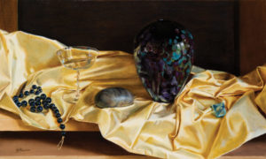
Mann, Vase and Blue Beads, 2008
LM: I have really been wanting to put fabric in my paintings lately. I think it’s because it does a couple of things beautifully. One is that it unifies all the objects in the still life. Everything is sitting on or near the fabric, so it brings everything together into one unit.
Even more importantly, the fabric brings sensuality to the painting. A lot of things in still lifes are very hard. I mean, they’re solid things—a rock, a vase. Fabric flows. I don’t know if it’s a personal thing, but something about fabric to me is very human. I imagine touching it, I imagine wearing it. I love clothes, so to me it’s a very tactile kind of thing.
Another great quality that fabric has is that it’s very moldable. So if I’m trying to do a composition and I want a line to go a certain way, I can just make the fabric go that way. I can make a big, swooping fold with it. If you look at Vase, Cloth, and Glass Bowl, the fabric became an object in itself, not just a backdrop. With fabric I can direct the eye almost any way I want it to go.
I do have to be careful, though, because fabric will do many things, but it won’t do everything. It can look tortured if you try to make it take on shapes it doesn’t want to, and it will tend to just go back and lay according to its nature.
In short, it’s dramatic, it’s useful, it’s sensual, and it’s beautiful.
CB: It certainly is, and well depicted in your paintings.
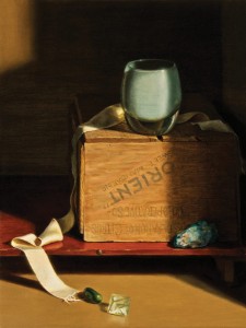
Mann, Ribbon, Orange Crate, and Votive Holder, 2010
Turning to Ribbon, Orange Crate, and Votive Holder (fig. 10). In viewing this painting, I first became fascinated by the ribbon. My eye wants to trace its every flip, twist, and turn. Beginning at the end near the crystal and green stone, which appear to have rolled off the ribbon, my eye follows it upward, across the mahogany platform, along the side of the crate, across the top to where it disappears behind the votive holder, picks it up on the other side of the holder, and then relinquishes the ribbon to the darkness on the right. From there, my eye descends through the dark shadow on the front of the crate to the vibrant blue-green stone sitting on the platform. From there it moves back and forth from the stone to the similarly colored votive holder, until it finally jumps diagonally from the stone to the crystal—which also contains those greens and blues—where the journey begins again. I don’t know whether others view it this way, but when I look at this painting, it’s almost impossible for me to view it another way. It’s sort of mesmerizing. Did you intend the viewer’s attention to move in this cycle? What was your thought process in laying out this composition?
LM: Yes, I intend for the eye to go in that cycle. However, generally in Western cultures, because of the way we read, the eye enters the painting from the upper left, so I try to take advantage of that. The little bit of light in the upper left is my entry point into the painting. My eye then goes to the votive holder. It’s bright, it has the highest contrast (with the dark background), and it’s the most colorful object, so it’s the focal point. Then my eye goes from the votive holder down the path that you talked about, following the ribbon down the shadow to the blue stone, and over to the bottom of the ribbon and up again. So the composition has that cycling effect, although as I said before, people will tend to look at what they’re interested in. But there’s a definite line, and you almost can’t help but follow a line with your eye; your eye wants to do that.
CB: I see no symbolism at all in your paintings. Why is that?
LM: I don’t think symbolism has any place in my kind of painting. The purpose of art is to give a viewer the immediate experience of abstractions made real, as though we could directly perceive the abstractions. The artist should present things so that at a glance one can get a sense of life, or whatever the painting is about. For example, a painting, if it’s done right, if it’s already been conceptualized and essentialized, might give one the experience that the world is solid and definite, made of real things that can be perceived by our senses. That’s the underlying theme of my paintings. Or a painting might give an immediate experience of a certain kind of character, as in Holbein’s Sir Thomas Moore. And so on.
A symbol doesn’t do that. For example, a painter might include the color yellow as a symbol of piety, and his audience might even understand that that is what it symbolizes. But yellow is immediately experienced as yellow, not as piety. Anything else is outside of the visual experience of the painting.
CB: You clearly put a lot of thought into your works from beginning to end. What are the more painstaking and more enjoyable parts of the thinking? And what do you see as the respective roles of the conscious and subconscious aspects of the mind in the process?
LM: Hmm. My paintings usually aren’t conceived of by actively thinking out what I want to do abstractly; they usually feel more organic than that. You know, I see an object I like, and I just put it on the table and go from there. I don’t usually start from an idea; the idea is usually about a thing, and so I start with the thing.
The composition itself, when I’m moving things around, involves a lot of thinking. But much of that thought, as I mentioned before, has been internalized, after studying the rules of composition. So that would go on subconsciously.
Probably the most enjoyable part is just looking and mixing the colors and putting down the paint. When I’m doing that, I just go with it; it’s not like I’m consciously thinking so much. I’m mixing paint and reproducing what I see without really thinking too much about it. And I’m not editing at all or using my conscious mind so much at that point.
Later on, I’ll take my painting into the house. I’ll have dinner and then I’ll come back to look at it. It’s then that my conscious mind comes in. I’ll think that I really don’t like the way something looks, or that my eye isn’t going where I want it to, or that a spot of color is too bright. I’ll take my notebook out and I start making notes about the things I’m going to correct the next day.
The thinking and note-taking use my editing or conscious mind, and the actual act of painting uses my observing and subconscious mind, and the two can’t function at the same time. I think it’s similar when you’re writing. If you’re writing, you can’t be consciously editing yourself. You get it all out, and then you go back and edit it. Otherwise, you’re always second-guessing yourself, and the ideas never flow. The same is true for me with painting.
CB: That’s an analogy I can relate to! What approach and techniques do you recommend for getting the most out of a trip to a gallery or a museum, or time spent with a favorite painting?
LM: I would say first to go alone. I find it very distracting to go to museums with other people. People always want to look at different things, and I find that I just can’t stand there and look at something I don’t want to look at.
Also, I don’t like to take tours. I find that docents almost always talk about nonessentials. They’ll talk, for instance, about the man in the picture, where he went to school, what his background is, etcetera. To me, that’s not the important part of the painting.
A painting is something you get all at once—it’s not something that you need an essay to explain. Of course, I’m not saying that you couldn’t have a good guide who actually talked about the composition or more relevant things about the painting, but I find it very rare.
Also, when I go to museums, I’m looking with an artist’s eye. I get up as close as they’ll let me get and try to figure out how the artist did what he did. Is there an underpainting under there? What kind of stroke did he use? Is that a glaze? So I’m always really close to the painting, and my husband’s always way back there, trying to take the whole thing in. It really depends on what you’re trying to get out of the visit. Most people are not going to want to be close up like I do.
Most importantly, I’d say only to look at things you love. You’re not obligated to stand in front of each painting. When I go into a museum, for example, when I went to the Frick in New York a few weeks ago, I made a beeline to my favorite paintings. Everything else, I didn’t spend any time on.
Art’s all about what moves you, and there’s no obligation to appreciate something. If you don’t like it, you don’t like it. For me, I don’t really like landscapes. So I can take them or leave them, and usually I leave them. I’ll walk right by those. In short, be selfish in a museum.
CB: I like that summation. What are you working on presently?
LM: Well, I took the summer off to be with my daughter and focus on studying voice. So I just started two weeks ago (early October) on a new painting. The focal point is a big, pale blue squash. I saw it at the market and I thought, “That’s my kind of squash!” So I took it home and collected a few other gourds and onions to go with it, and am just beginning to set it up now. I haven’t quite selected my perfect setup yet. But I have to work quickly when I work with organic things because they only last a few months—some only a few days. You’ll see long-lived squashes and onions in my paintings, but you won’t see ephemeral grapes!
CB: Well, I look forward to seeing the little world and companions of the big blue squash. Speaking of which, where can people see your work?
LM: The best way, other than coming to visit me in my studio in Seattle, is to go to lindamann.com. It’s always best to see paintings in person, but the computer’s pretty good. My website has details underneath the pictures, and I highly recommend clicking on those, because you can really see what’s going on, the strokes, how the painting is done. That’s the next best thing to actually being there.
CB: Thank you for your time and the education.
LM: You’re welcome. It was a pleasure.

![[TEST] The Objective Standard](https://test.theobjectivestandard.com/wp-content/uploads/2017/10/logo.png)


