Author’s note: An extensive gallery of original photography of the National Gallery of Art and its superb collection can be found here.

Photo Credit: Lee Sandstead
If, like me, you hold that art is a necessity of ardent living, then experiencing art is one of the most crucial aspects of your life. And just as food is not meant only to be looked at in magazines but eaten—so too paintings and sculptures are not meant merely to be looked at in books, but devoured in person. This requires visiting museums, where most great art is housed.
My favorite museum, after years of travel and thousands of hours spent in museums, is the West Building of the National Gallery of Art (NGA) in Washington, D.C. Although there are larger museums with bigger collections—most notably the Metropolitan Museum of Art in New York City—the NGA has a first-rate collection, a top-notch preservation policy, and a spectacular architectural setting.
In America, museums on the East Coast have the strongest collections. Those such as the NGA, Met, and Museum of Fine Arts (MFA), Boston—recipients of the generosity of America’s 19th- and early-20th-century collector-industrialists—contain the largest, most-diverse group of masters and masterpieces. Museum collections in the western and southern parts of the country tend to consist more of second-tier artists and artworks. The J. Paul Getty Museum in Los Angeles, for instance, is a well-endowed museum with a large but relatively weak collection. It has no original Vermeers, merely a copy of one. Likewise, its A Young Girl Defending Herself Against Eros is not the original by 19th-century master William Bouguereau, but rather a much smaller reproduction done mostly by his assistants. Although the Getty does have a Raphael, it is a minor, early portrait, rather than one of his celebrated Madonnas. The museum’s Canaletto is not one of his giant panoramas of Venice, but a minor painting of the Arch of Constantine. By contrast, the NGA has four Vermeers, five Raphaels, and nine paintings by Sir Peter Paul Rubens; no West-Coast museum comes close to having masterworks on this scale.

Leonardo da Vinci, Ginevra de’ Benci, ca. 1474/1478. Housed at the NGA, this is the only painting by da Vinci in the United States. Although only in his early twenties when he painted Ginevra de’ Benci, Leonardo was at his innovative best in this painting, placing the sitter in an outdoor setting, positioning the body in a three-quarter pose, and using a new medium—oil painting. Photo credit: Lee Sandstead.
Created by an act of Congress in 1937, the NGA was formed largely from the donated collections of Andrew Mellon and Samuel Kress, and it features a robust collection of Renaissance, Baroque, rococo, neoclassical, Romantic, and American art. It houses the only painting by Leonardo da Vinci in the United States and important works of several masters, including Rembrandt, Boucher, Fragonard, David, and Bierstadt.
Although the Met and MFA house similarly excellent collections, the NGA exceeds both museums in terms of environment. The West Building of the NGA, designed by John Russell Pope, the last great architect of the American Renaissance, is an architectural masterpiece crafted specifically to deliver a grand, highly elevating experience. Huge halls, gorgeous marbles and granites, sumptuous wainscoting, parquet floors, and small, private interior gardens uplift visitors and provide the perfect companion and home for the art. This is because, unlike many museums, the NGA building is still intact according to its architect’s original design.
Most museums built during the American Renaissance have been hacked up, added to, or otherwise “modernized.” In many cases, these additions depart from the orderly and aesthetically pleasing interior design principles of the Renaissance, in favor of white, sterile walls, with layouts that eschew rational planning, leaving the visitor confused as to where to go—or worse.
For instance, the Met’s Charles Engelhard Court, formerly one of the finest interior spaces in all of America, has tragically been altered. The Court once housed many of America’s greatest sculptural masterpieces in lush gardens, but much of the greenery and sculpture has since been relocated to accommodate a cafeteria and to create more space for the museum to host swank parties. The sculpture that remains must now be experienced with the sound of people banging plates and yukking it up.
The main entrance to the MFA is an all-too-common example of modernism’s influence. The visitor once stepped through the Huntington Entrance into a world of fine sculpture, marble steps, columns, and murals. Although one can still enter the museum from the Huntington (I always do), the new main entrance is a large, non-celebratory glass and Sheetrock room that looks like a bad airport terminal, leaving the visitor asking, “What’s the purpose of this place?” and “Where do I go now?” The modernist disdain for grandness has affected entrances of other museums as well. The North Carolina Museum of Art effectively hides its entrance; the place looks like a Wal-Mart distribution center around which first-time visitors walk in puzzlement looking for an entrance—any entrance.
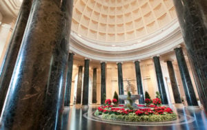
The interior of the domed rotunda of the West Building of the National Gallery of Art.
The NGA’s main entrance was designed to elevate and ennoble the art inside. Photo credit: Lee Sandstead.
Thankfully, the NGA is in stasis. The visitor climbs numerous marble steps into a large, domed rotunda featuring a granite fountain surrounded by luxurious foliage and flowers. Twenty-four Italian marble columns carry the visitor’s eye throughout the giant space and acclimate him to the grandness of the art yet to come. The cafeteria is tucked away, as it should be, far from any galleries. At the NGA, the best of America’s past is still permanently displayed in a sacred, unsullied temple to art.
Of course, a fantastic collection in a great building means nothing if the visitor cannot see the art clearly, and the NGA offers some of the best-lit, best-conserved paintings in America.
One of the challenges for lighting paintings is minimizing extraneous glare, lighting from unintended sources, such as doorways and windows. At the NGA there are no windows in any of the painting galleries. The paintings from the NGA photographed for this article were taken during daylight hours; had windows been present, extraneous glare would have been inevitable. But because the NGA’s lighting is man-made and purposefully calibrated, each painting is evenly bathed in just the right light.
Unfortunately, this concern for proper lighting is not as common as one would think. For instance, the planners of the most recent large-scale museum to be built in America—the West Building of the North Carolina Museum of Art—decided to collapse the distinction between interior and exterior by placing giant windows around the museum. This design choice makes it almost impossible for visitors to appreciate the paintings during the day because most are completely awash in extraneous glare and/or random shadows.
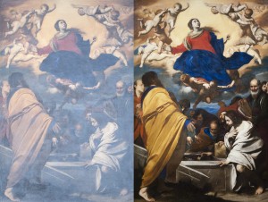
Massimo Stanzione, The Assumption of the Virgin, ca. 1630–1635. These photos show the difference between viewing paintings in the North Carolina Museum of Art during the day (left) and viewing them at night (right). Photo credit: Lee Sandstead.
Another aspect that is crucial to the viewer’s ability to appreciate art is a museum’s conservation program (or lack thereof). When oil paintings are finished, most artists put a clear coat of varnish over the painting to protect it. Over several decades, the varnish yellows and needs to be replaced. When I first learned of Titian, I was taught that he was a brilliant colorist and that the Prado in Madrid had a large collection of his paintings. I was unaware of the yellowing of varnish with age, so when I finally saw the Titians in the Prado—which are in a terrible state of conservation—I was taken aback. Did I suffer some defect that prevented me from seeing their beautiful color? Later, during my years studying the art in New York City’s auction houses alongside the world’s finest collectors and advisers, I learned of the profound visual impact of yellowing varnish and gained appreciation of the importance of restoration.

Anonymous artist, circle of Jacques-Louis David, Portrait of a Young Woman in White, ca. 1798. Note the difference between the photo taken in 2005 (left) and the photo of the same painting taken in 2011 after it has been restored. Photo credit: Lee Sandstead.
Every museum has its own policies on conserving its collections, techniques for maintaining or restoring artworks, and funds with which to do so (or not). American museums are generally good in this regard and the NGA in particular has a robust conservation policy and the funds to back it. (Although every artwork has been donated, the museum, unfortunately, is funded largely through taxation.) Looking above at the photographs of Portrait of a Young Woman in White, one can see how the aging varnish alters the colors, reduces contrast, and flattens depth—and how proper conservation, such as that carried out here by the NGA, restores these elements.
Another crucial aspect of any museum is accessibility. If getting there is too much trouble or costs too much, you’re not going to visit frequently enough to milk the collection for all it’s worth. The NGA is eminently accessible. Located on the National Mall, a few short blocks off Interstate 395 and surrounded by ample free parking, the only challenge to visiting the NGA is Washington’s fairly predictable rush-hour traffic. And if one visits early on the weekend, one can usually park within a block or two of the entrance.
Many other museums have significant accessibility problems. The Met is easily accessible for locals, but it can be a real hassle for out-of-towners. Parking, shelling out for taxis, or navigating the New York subway system can make a visit difficult and costly. (Those with toddlers who use the subway must drag their strollers up two flights of stairs to street level, as there is no elevator at the nearest stop.) The MFA has ample parking, but getting there can be time-consuming and frustrating for nonlocals because of Boston’s confusing streets and the lack of GPS signals in its extensive tunnel system. Worst of all is the Disney-like experience of visiting the Getty, America’s least accessible large museum. First, there is the unpredictable and torturous L.A. traffic. Next, there is the Getty’s awful underground parking lot, which spirals down as if into the pits of hell. And finally, after emerging from the abyss, one must wait in line for a trolley up the long hill to the distant museum.
When I first discovered the importance of art, I had to see the masterpieces in person. Nothing mattered to me during those museum visits except the artwork in front of me—neither its setting, nor its state of conservation, nor its accessibility. But I’ve since learned that all of these affect one’s ability to fully appreciate a museum’s artworks.
Whichever museums you choose to visit in your explorations of art, I hope you’ll count the NGA among them. In light of the above criteria, I regard the NGA as the sanctum sanctorum—the holy of holies.

![[TEST] The Objective Standard](https://test.theobjectivestandard.com/wp-content/uploads/2017/10/logo.png)


