Think of great architecture, and one immediately envisions places such as New York or Chicago. But Tulsa, Oklahoma, is home to some of the nation’s most striking art deco buildings—from that era between 1920 and 1940 when the city was the “oil capital of the world,” and the skyline rose in steel towers that still stand proud downtown.
In fact, Tulsa has embraced its art deco tradition so strongly that it boasts an Art Deco Museum and several published guides—most recently Art Deco Tulsa by Suzanne Fitzgerald Wallis—to help visitors appreciate its rich architectural tradition.
As Wallis notes, art historians debate what “art deco” means, given that the term didn’t originate until the 1960s. But they generally agree that it encompasses three styles: Zigzag, Streamline, and PWA, the latter referring to the New Deal’s Public Works Administration, the government program behind projects such as Hoover Dam. The PWA style is boxy and authoritarian, often decorated with friezes depicting mythological or historical subjects. Tulsa’s Fire Alarm Building—once home to the city’s fire department dispatch facilities—is a prime example, with its heavy, square structure and its facade featuring firehoses with dragon heads and a figure reading a fire alarm printout. The more outlandish Zigzag style was inspired by Mayan ziggurats and featured angular motifs—such as the labyrinthine decorations in the entrance of the Sinclair Building. And the Streamline style, with its futuristic curves and aerodynamic lines, is on display in the Phoenix Cleaners building or the Whenthoff Residence.
Tulsa owes many architectural treasures to Waite Phillips, founder of Phillips Petroleum, who built several office buildings, most notably the Philtower and Philcade. He lived in the Philcade, a striking example of Zigzag with elaborate ceilings, brass chandeliers, and gleaming marble. Phillips was so proud of its towers that he had his initials worked into the trim and painted on the doors—and he would doubtless be pleased that it houses Tulsa’s Art Deco Museum today.
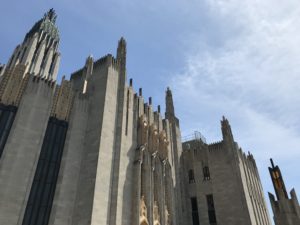
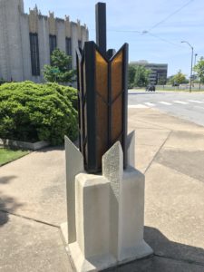
None of the city’s buildings, however, can compete with the Boston Avenue Methodist Church, built in 1929 at the end of downtown’s main thoroughfare. Its designers ensured that every detail—from the top of its tower to the lights in the parking lot—would harmonize in a striking geometry of openness and light.
Those designers were high school teacher Adah Robinson and her former student, a young prodigy named Bruce Goff. It’s a matter of dispute how much each contributed, but Goff, who became one of the century’s most creative and prolific architects, was then only twenty-five and a draftsman in a firm where he had worked as an intern since the age of twelve. He had not only studied under Robinson, but had designed her home. Yet Robinson—who executed many preliminary sketches for everything from the overall floorplan to the design of the murals—seems to have created the overall aesthetic for the building and relied on Goff to bring her vision to life.
Robinson thought religious architecture had become obsolete and that modern churches “should not be final, ominous, conscious of wealth or temporal power,” but “by a vertical dominance of line, suggest the open mind.”1 She based the roof decorations on hands raised in prayer; the stained-glass windows, on native Oklahoma flowers. Stately, futuristic light fixtures and luminous corridors give the interior a feeling of radiance that contrasts with the gloom of many churches.
But it seems likely that Goff—whom Frank Lloyd Wright called “the finest designer” of “all the American architects”—came up with some of the building’s more innovative and controversial features, such as the circular sanctuary and porte cochere that allowed worshippers to enter the building without being rained on.2 These ideas, Goff recalled, were “considered very irreligious and downright sinful. . . . You were supposed to suffer and walk through the rain from where you parked. You were supposed to sit on hard pews instead of a comfortable seat.”3 Still, the church was swiftly recognized as a masterpiece, and Goff soon designed other art deco triumphs in Tulsa, including Riverside Studio, Guaranty Laundry, and the Tulsa Club.
Art deco sought to reconcile industrial mass production with the fine arts in a way that was both inspirational and elegant: to replace the stately permanence of classical architecture with a vibrancy and dynamism appropriate to the new technological age. And architects in places such as Tulsa had an extra incentive to stand out. “We knew we were on the outskirts of civilization,” said Goff late in life. “New York and others in the East always looked at this part of the country as a jumping-off place . . . [but] we were wanting to build something and make something out of it.”4 That they certainly did.
Click To Tweet
You might also like
Endnotes
1. Suanne Fitzgerald Wallis, Art Deco Tulsa (Charleston: History Press, 2018), 51.
2. Wallis, Art Deco Tulsa, 35–36.
3. Wallis, Art Deco Tulsa, 55.
4. Wallis, Art Deco Tulsa, 39.


![[TEST] The Objective Standard](https://test.theobjectivestandard.com/wp-content/uploads/2017/10/logo.png)


